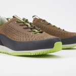
Back in 2006, Ecko Unltd was still one of the major players in the mult-billion-dollar street wear industry. Marc Ecko, the Fashion mogul and creative head behind the brand reached out to Savoir Studio’s founder, Michel Abraham, to refresh the Ecko Function line.
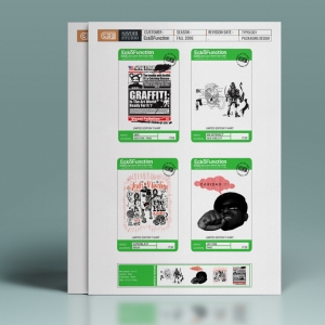
To introduce the re-launch of the brand, and to underline its reinvention, we asked four influencial and world-reknown Street Artists to join forces with Savoir Studio for a limited edition Ecko Function t-shirt line, featuring their artwork, that would be sold in the most exclusive street wear boutiques worldwide. We asked artists WK Interact from New York, Jayone and Skki from Paris as well as Superblast from Berlin to create original artwork to print on these tees.
 The whole project was a success, and was featured in many fashion blogs and magazines. It even ended up in the very selective and hip Fashion Boutique Colette, in Paris. Colette is not a store like any other, having your product selected by them doesn’t mean getting a big order, but it can “make a brand” in terms of image. Their selection is very precise, and influential.
Designers and Fashionistas from all-over the world keep a close eye on Colette’s selection, to know what will be the next trend.
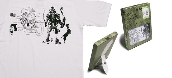
Each one of the four artists we selected have a very particular and personal style, so we knew in advance the artwork for the four t-shirts would be extremely different from each other. In order to give coherence to the project, the four t-shirts, beside sharing common labels and patches, needed to share colors as well.
We decided all t-shirts would be white and asked these four amazing artists to use only black and red for their artwork.
These artists’ artwork is very valuable, and we needed to find a way to communicate that. We decided the t-shirts would only be printed once, as a very small run, a limited edition, aimed at street art aficionados and collectors. To underline the value of the art even more, we needed to design a packaging that would both be relevant to the image of the ecko function brand, but also look rich. It meant we would not save, and would use premium quality materials and finishes. This is such a rare thing in the fashion market, that we even got calls from the sourcing office in Hong Kong, to make sure we knew how expensive the box would be. “It’s OK” we told them. “We know what we are doing”.
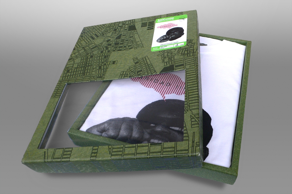
The box had to relate to the art world, otherwise it would only be another cardboard box… integrating elements from the artists everyday life and integrating them into our packaging design would be the easiest way. As these artist’s t-shirts would only be printed 178 times worldwide, we decided to number every box the same way art lithographies are numbered. We would stamp on the box: 1/178, 2/178, etc….
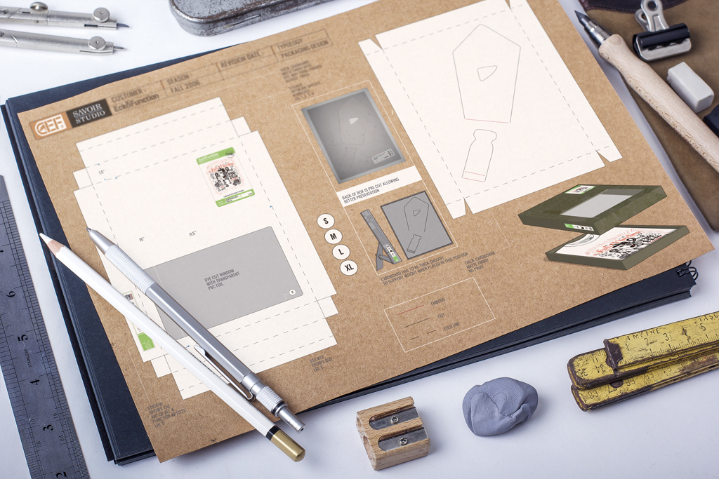
But we needed another idea, that would impact the structure or form of the box itself. As Michel Abraham was walking through a department store in search for a frame to decorate his living room, he saw very cheap wood frames, which boards at the back were pre-cut cardboard. By pulling a part of it out, it would stand on it’s own! He brought a sample back to the studio and we flipped the idea! By using the same concept, we decided to dye-cut the back of the box, allowing it to transform into a picture frame…It made the trick.
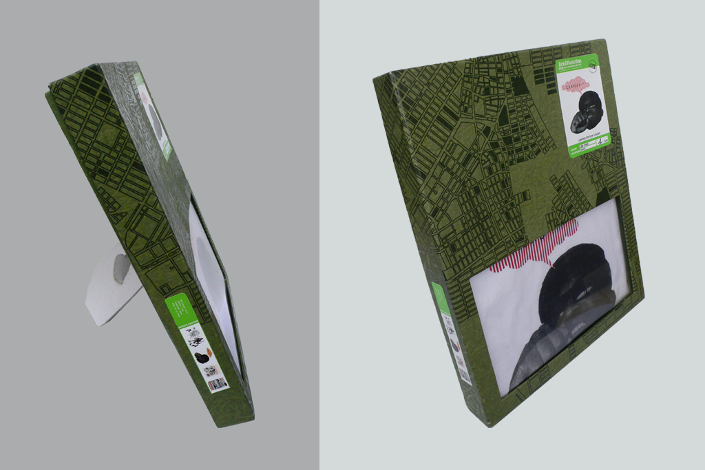
We knew we needed the packaging to convey the identity of the brand. The city of New York being at the core of the brand’s DNA, a shiny print inspired by Manhattan’s map on a mat cardboard ground would look great. We asked Dan Funderburgh, an incredibly talented illustrator and artist, to create it. We then chose a tone of green that we used extensively in the line. As it is hard to sell garment inside a box, we added a transparent window to the box, to show the t-shirt without having to open the box…we simply dyed cut the front of the box and used a glossy piece of pvc sheet glued inside the box.
 To differentiate the artists, stickers were the most logical, cost effective way. They would specify the name and city of residence of every artist. Of course, to be consistent with the concept of the apparel line, the design had to be a mix between military references and big city life (we called that metro-military ).
Therefore, we used a stencil type with very bright contemporary green color.
Finally, we needed a way to tell the story. We nailed the t-shirt and the packaging, all we needed now was to add a nicely designed booked with 4 artist’s biographies and a presentation of their work. Somehow like a mini art book we placed in every box with the tees.
The artists loved the way we treated their art, we created considerable buzz online and in the press, and contributed to build the brand’s image. We all loved to work on this project. Everybody’s happy!